One of my favourite record labels, 'Acid Mist', was often advertised in the most unusual places. I found these tantalising snippets in the back of some old issues of an industrial trade magazine called 'Processing'. They date from 1971-73.
'Technology & Technicians' was a library record recorded in Cathedral Studios, Lincoln in 1971. Sounds and textures for the laboratory.
'Versatile Pot Recorders'. Folk quartet from Grantham who pioneered use of the the 'synthaesia' device, pictured above. A small modular instrument that induced trance-like sensations and bizarre hallucinations amongst players and listeners alike.
Eponymous debut EP of Keep It Dry, funk quartet from Biggin Hill. Design by Peter Saville's brother James.
Acid Mist's biggest selling group in 1972 was 'Let's Get Together', a proto-industrial easy listening trio of arrangers and singers from Leicester. The album they're promoting here ('The Full Force in Filtration') was released on spin-off label 'Separation'.
Acid Mist dabbled in electronics, launching the Tricon synthaesia range. They were banned on the continent following a festival in Rotterdam.
Poster advertising Dusseldorf-based krautfolk group 'Particle Free'.
Another spin-off label, launched in 1975 was 'Joy' - it used the Acid Mist in-house session musicians to record dance music for the newly nationalised Locarno dancehall chain.
A promotional poster for failed teen idol Robbie Pursey. Unsure how to promote him, Pursey's Acid Mist singles flopped. Pursey left the music industry in 1976 to form a commune in Hull.
Water was a Christian bass-drums-synth/flute trio who recorded 'Electric Drilling' at Cathedral Studios in late 1975. Founder member Davey Twilley (pictured on the album cover) composed the original music for 'Play it Safe' and the alternative faiths programme 'Kandlemas'.
All of these items are extremely valuable but very scarce. Many are not even listed in buyers guides.
Friday, 18 February 2011
Concrete
Monday, 7 February 2011
Carnaby Street 68
Most people will know that the media image of what '1968' looks like bears little resemblance to the real thing. On history programmes you tend to see that shot of a young man trying on a guardsman's jacket in 'I Was Lord Kitchener's Valet' and then maybe John Lennon's psychedelic Rolls Royce followed by the Post Office Tower sprouting up through some bomb sites. All cobblers of course - in many areas the visual cues that we associate with the sixties only started appearing in the seventies, with long hair and bright bri-nylon clothes. Most of the people in C.E Fudge's photographs have a timeless, crisply preppy look with the shops and architecture taking the lead in appearing to be futuristic. Of course, these precincts and developments were new, many of them under 10 years old but it doesn't always yell '1968' when you look at them.
To remedy this, the next set of pics were taken when C.E. travelled to the nexus of swinging London to photograph some of the boutique shop fronts on Carnaby Street. The architecture isn't new, but the design aesthetic is. Let's have a look.
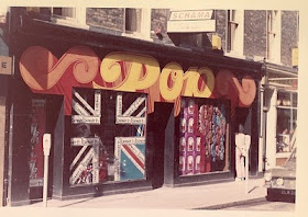
Here's Pop, already showing signs of self-parody judging by the display in the window.
His 'N' Hers is notable for being orange and looking a bit like a psychedelic Greek restaraunt. The flags are good though, as is the 'Detroit Cleaners Ltd' next door and the old Pepsi sign on the other side.
A little research tells us that this is the painted brickwork above 'Lord John' on the corner of Carnaby and Ganton Streets. Shades of the Apple Boutique, although I imagine that mural wasn't up for very long before it was whitewashed.
A quick look at Habitat, although C.E. tells us that this was on Tottenham Court Road. I like the jar in the window that says 'Beans' on it. Lessons in design no.1 - how to design a timeless shop brand.
Sacha was a shoe shop and looks a bit gloomy to be honest, like an old seaside aquarium. Of more interest is the cinema next door - apparently the Academy 1-2-3, quite an important picture house that had an art-house reputation (although they are showing Yellow Submarine by the looks of things). And I'd bet a guinea that that's a Wimpy Bar next door. There are still two in Doncaster!
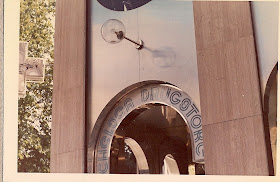
Here's the one that really grabbed me - the Chelsea Drug Store. Now an icon for fans of sixties culture and design, it housed bars, shops and a chemist and is shown in its glory in 'A Clockwork Orange'. In this picture it looks a little like the foyet of a provincial leisure centre. Come on C.E.! Go inside!
Bugger. Looking more futuristic than before, C.E. apparently went inside the Drugstore and didn't take any photos, although it is recommended for 'the audio-visual experience and the powerful air-conditioning'. If you've seen the interior in 'A Clockwork Orange' you will know how startling and exciting it was, and it tells us everything and nothing about the nature of modern London and modern culture that the building is now a MacDonalds.
That's it for specific site visits, although C.E. did take some photographs of markets, which I will share with you next time. And as a stop press, top BC reader Christopher Marsden has contacted me with some information re the identity of C.E. Fudge. But that's for next time..
Thursday, 3 February 2011
Sheffield Castle Market 1968
The 1968 tour of British new-build shopping precincts continues, and today we pitch up in Sheffield. I've already explored the modern-day Castle Market in a previous post, and Unmann-Wittering took some great pictures of the covered market and signage on Found Objects. C.E. Fudge paid the place a flying visit and I like seeing it when it was less neglected.
Approaching from Castle Street, the market looms up out of the road like the island of an aircraft carrier.
Some good swastikas in the upper windows.
Ena Sharples fingers a blouse in the foreground.
Taken from the upper walkway and looking out toward Hyde Park flats - they built a lot of social housing in Sheffield after the war. Even in 1968 the walkway looks empty though. And concrete's propensity to age prematurely (a la Cumbernauld)is shown up again.
Max Wall passes up the chance to buy some fish.
So far, 1968 hasn't been particularly swinging, but C.E. Fudge and I will remedy that with the next set of pictures, in London's epicentre of cool (or just shopping).
Tuesday, 1 February 2011
Coventry 1968 and 2011
There has been a lot of interest in C.E. Fudge's photographs, especially with regard to the sets taken in Coventry and Cumbernauld. Many people have recognised modern features and picked out places from their youth, but Paul & Elizabeth at Inversion Layer have made a direct photographical 'Now and then' comparison for Coventry city centre.
You can view it here and the rest of the site is well worth a look too. Further updates are in the pipeline but work (and a slow build-up of new photographs) mean I'm snowed under at the moment. Soon, soon ...